View in a browser

NOT YOUR GRANDMOTHER’S PINK

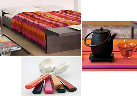
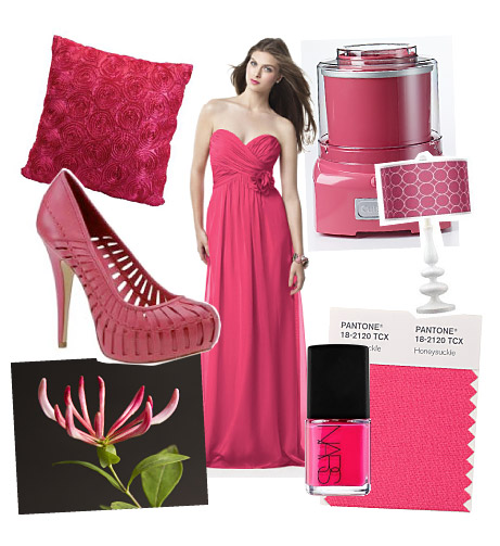
This is not the shy pink of dawn, the sleepy pink of summer lemonade, or the tidy pink of gingham curtains. This is pink with attitude. A bold, intense, don’t-ignore-me color.

Honeysuckle 18-2120, the PANTONE Color of the Year for 2011, is a confidant, assertive shade of lusciously saturated pink that fuels our desire for change and ignites our spirit, to help us meet the challenges of everyday life. It commands our attention and rewards us with a good dose of confidence and energy. Showing up just about everywhere from men’s and women’s apparel and accessories to footwear, cosmetics and furnishings for the home, Honeysuckle has become a global call for positive thinking and concerted action. Read more about the Color of the Year at https://www.pantone.jp/coy2011

Have you spotted Honeysuckle lately? We invite you to send in your photos of Honeysuckle wherever you see it. We’ll publish the most interesting submissions. Send entries to tones@pantone.com with the word Honeysuckle in the subject line.
Tweet   Bookmark and Share

TONES by Pantone v2.01: Color News & Views
Not Your Grandmother's Pink
Shades of a Decade: A look back at 10 years of PANTONE's Color of the Year
PANTONE Fashion Color Report for Fall 2011
A Total Brand Experience
Coloring Brazil Street by Street
Spray-On Fabrican - Where Fashion Meets Technology
Lighting Up Your Smile with LEDs
Pantone Recognizes WGSN Global Fashion Color Award Winners: Chris Benz, Top Shop, Uniqlo
Trends: Is Bold Color the New Black?
Gypsy Heritage
Masstige Market Continues to Gain Appeal
Lunar: A Palette For All Time
Japan Creation Outlook - Autumn/Winter 2011
Focal Points: Creating That Palpable Presence In the Home
  Interview: Marije Vogelzang

This Issue's Contributors
PANTONE® 18-2120
Honeysuckle
   

SHADES OF A DECADE:
A LOOK BACK AT 10 YEARS OF PANTONE’S COLOR OF THE YEAR

Each year, Pantone surveys the cultural color landscape and pinpoints an emblematic color that both reflects the zeitgeist and portends the central, imminent color trend across every industry where color is crucial to success.

To decide on the Color of the Year, Pantone color experts confer with a broad cross section of designers from around the world who are involved in fashion, home furnishings and industrial and print design to find out the colors they think will be important in their businesses for the coming year. This input is sifted to find the color family that is fresh and new, as well as common to many different industries. From there, Pantone narrows the palette down to a specific shade within that color family that is consumer friendly and can be used to sell all types of products and packages.

In making its annual color selection, Pantone also considers cultural factors such as social issues, the economy, technology, lifestyles and play styles, diversions, entertainments and the needs, moods, fantasies and aspirations of consumers.

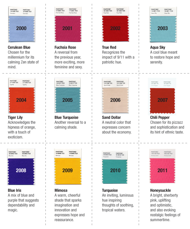
Here is a look back at the first millennial decade as seen through the PANTONE Color of the Year prism:
Tweet   Bookmark and Share

PANTONE FASHION COLOR REPORT FOR FALL 2011

PANTONE’S Fashion Color Report provides a first look at the season’s top fashion color picks from the industry’s leading designers. The stabilizing yet sometimes surprising palette evokes the rich and complex notes of autumn, from the comfort of a glowing fire to the sweet mystery of a deepening fall sunset. “Designers take a painterly approach to fall 2011 by artfully combining bright colors with stable neutrals, reminiscent of how an artist would construct a stunning work of art,” said Leatrice Eiseman, executive director of the Pantone Color Institute. “Much like a painter’s masterpiece, there is a certain romance to this season’s palette.”

Tweet   Bookmark and Share

Follow this link to read – and savor – the PANTONE Fashion Color Report for 2011.

A TOTAL BRAND EXPERIENCE

As Leatrice Eiseman (www.eisemancolorblog.com), executive director of the Pantone Color Institute, explains in her book Color Messages and Meanings, “While it is a given that a successful brand logo is a happy marriage of shapes, symbols and colors, it is truly the colors that evoke the emotional message.” Many leading brands are so linked to specific hues that they are primarily recognized by their color or colors. Think Coke red, American Express blue, Kodak yellow and red, and DeWalt black and yellow. When a color and design “signature” is established it becomes the brand identifier that reinforces the image in the marketplace across many levels of communication. This should include print and collateral materials, Websites, packaging, point-of-purchase displays, signage, as well as the product itself, creating what is termed a “total brand experience”.

Consumers need to have that brand experience whenever they shop or seek information about a brand, as it reinforces the image and helps to establish that they will receive the same quality and service across many platforms.

Leatrice Eiseman, Executive Director, Pantone Color Institute
Color Messages and Meanings
www.eisemancolorblog.com


Tweet   Bookmark and Share

COLORING BRAZIL STREET BY STREET

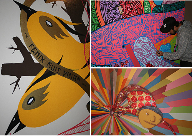
The world of art has a major influence on trends and when it comes to street art, Sao Paulo, Brazil has grown to become a globally influential hive of creativity. From Andre Farkas to Rui Amaral and Mazu Prozac, the graffiti scene in Brazil is really heating up. Most recently we saw TRANSFER, (https://transfer.art.br/), an exhibition showcasing visual art, street art, skateboarding, independent music, as well as underground comics and fanzine art taking center stage. Featured here were original artwork and site-specific installations from internationally acclaimed Brazilian and American artists with roots in urban culture. Highlighted were the history and complexity of these interrelated creative cultures between both nations that are now merging with the mainstream art world on an international scale. Influenced by the underground subculture as well as their Brazilian roots and traditional folk motifs, the dazzling color palettes created were a beautiful sight to behold.

Tweet   Bookmark and Share

Pantone Color Team

SPRAY-ON FABRICAN – WHERE FASHION MEETS TECHNOLOGY

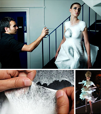
Over the years we have seen many unexpected things released from a spray can, including cheese, insulation, cosmetics and hair. Well, now we can add clothing to this list. More than 10 years in the making, Fabrican, (www.fabricanltd.com), the world’s first fabric in a can, is an aerosolized liquid sprayed directly onto the body in order to create wearable garments. Working with particle technologist Paul Luckham, trained fabric designer and Fabrican inventor Manuel Torres developed a formulation of suspended fibers, binders and polymers that when combined together create a strong non-woven material. Fabrican sprays on cold, but the layers of fiber quickly dry and bond together, forming into a snug-fitting garment that feels like a rubbery suede. While there are many other industries where the flexible adhesive properties of this technology could easily be applied, we must first wait and see if this new approach to the application of fabrics has the stickiness to survive.

Pantone Color Team


Tweet   Bookmark and Share

LIGHTING UP YOUR SMILE WITH LEDS

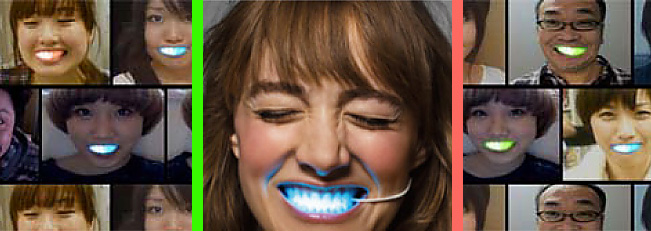
There was a time when gold front teeth or those embedded with expensive jewels were all the rage. Now, Japanese schoolgirls are behind a new era of fashionable accessories for their front teeth. These new “fronts” contain bright multicolored glowing LED lights and, though originally created as an experiment by two Japanese designers for a commercial advertising a winter sale at Japanese clothing store, Laforet Harajuku, (www.laforet.ne.jp), they are quickly becoming a sought-after accessory, Changing colors wirelessly through a computer interface, the LED smiles can easily be affixed to your teeth and glow different colors while you smile. Though they certainly light up your smile during the day, they truly are a sight to be seen when viewed in the dark.

Pantone Color Team

Tweet   Bookmark and Share

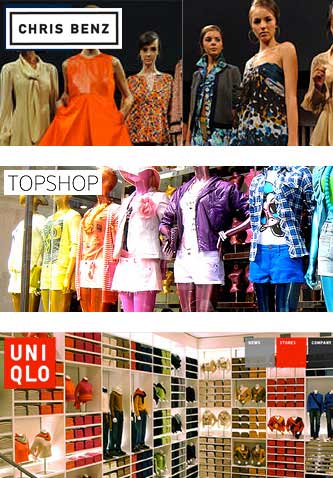
PANTONE RECOGNIZES WGSN GLOBAL FASHION COLOR AWARD WINNERS: CHRIS BENZ, TOP SHOP, UNIQLO
If design is the voice of our culture, then colors are the words it speaks.

With color playing an integral role in the world of design, it is important to recognize those individual designers or retail companies that are noteworthy for their unique and expressive use of color in the collections they create, and use color to best communicate our moods, our desires, and our hopes.

Launching his first collection at NY Fashion Week in February 2007, designer Chris Benz (www.chris-benz.com) is someone who has repeatedly displayed a love of color and pattern and continues to inspire us by showing an array of unusual, unexpected and striking color combinations within his collections season after season.

International retailers Top Shop (www.topshop.com) and Uniqlo (www.uniqlo.com) are both unique companies that in recent years have been consistently engaging and daring their shoppers with bold color and style, capturing the world's imagination by partnering with iconic models and artists to create capsule collections that are vibrant, vivid and full of character.

Pantone Color Team

Tweet   Bookmark and Share


IS BOLD COLOR THE NEW BLACK?

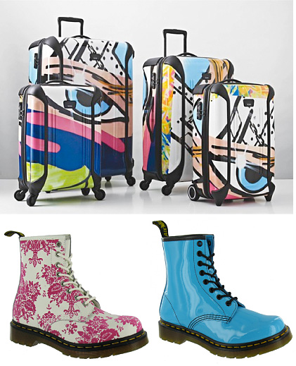
First we saw the popularity of 50-year-old iconic shoe brand Doc Martens altering their brand perception by introducing their classic work-wear boot styles in Liberty of London floral prints and shiny shocking brights. And now, coming up in March 2011, Tumi Luggage, another brand whose heritage is rooted in an illustrious black shade, will introduce Tumi Tag, a limited edition luggage collection and one-of-a-kind iPhone case created in collaboration with John "Crash" Matos. Beginning his career in the urban art of graffiti at the age of 13 by tagging subways and buildings, Matos's vibrant, multihued designs on canvas currently appear in museums around the world. So, whether you're going on a day trip or embarking on a long voyage, now you can travel in colorful style.

Pantone Color Team

Tweet   Bookmark and Share

GYPSY HERITAGE

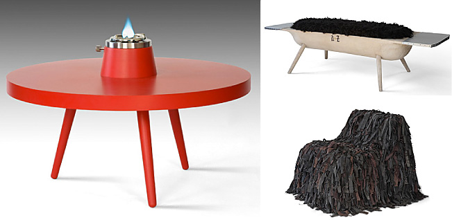
As we learn from David Shah in the most recent issue of Viewpoint (www.view-publications.com), a renewed interest in vanishing cultures is aiming to reconnect consumers to heritage and tradition through the objects they live with. Inspired by the gypsy folk culture of Hungary and Transylvania, Hungarian design duo A+Z (www.a-z.eu.com) set out to create an emotional connection to the stories and customs of their past, present and future through contemporary design. Their collection, called “Gypsy”, celebrates the survival instinct, vividness and community cohesion of the Gypsy people of Hungary and Transylvania. It includes the Tuzhely low table containing a built-in camping gas stove for communal tea drinking; the Puli lounge chair with a perforated metal frame upholstered with recycled fabric strips, inspired by the Hungarian sheepdog; and the Tekno seat which is made from a natural aspen wooden shell, hand carved by Transylvanian Gypsy tribes and upholstered with black sheep’s wool. The duo, whose Budapest studio is located in an old weapon factory, says of the collection, “The products of the Gypsy people and folk culture of our region have become overlooked or rendered unnecessary, but all have stories, souls and extinct crafts behind them. We wanted to give them new lives in a contemporary design context, keeping the narratives and souls but translating them with a modernist vocabulary.”

David Shah
View Publications

Tweet   Bookmark and Share

MASSTIGE MARKET CONTINUES TO GAIN APPEAL

With more and more prestige brand designers moving outside their realms to form new partnerships where they can apply their creative talents to lower-priced apparel lines, we see a bright future ahead for lower-priced designer fashions. As a result of the democratization of design, depressed spending and quickly shifting consumer preferences, designer-led projects in lower-priced categories continue to flourish. From Olivier Theyskens’ new range for Theory, Stella McCartney’s collaboration with La Redoute for children’s wear, Lanvin’s venture with H&M and Jil Sander’s J brand offered at Uniqlo, it is clear that we are in a new phase of fashion history. Personalized dressing is on the rise, and mixing and matching fashion styles is taking place in all age ranges and within all income brackets, leaving designers that are clever and innovative thinkers rising to the challenge of being able to offer design, functionality and quality that is good enough at a lower price point. Fashion should be about finding new and different ways to express yourself and, at this new reasonable cost, why shouldn’t you?

Pantone Color Team

Tweet   Bookmark and Share


LUNAR: A PALETTE FOR ALL TIME

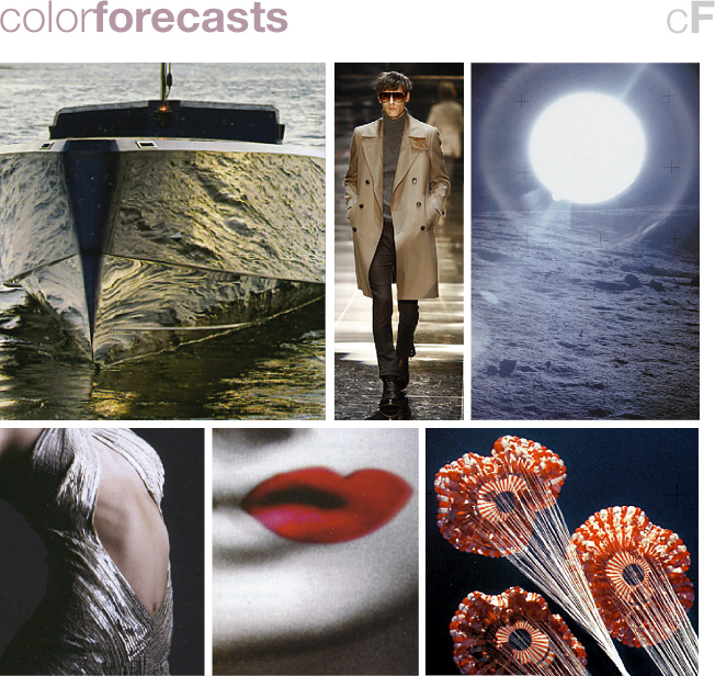
While we love the cool understatement and the beautifully quiet feeling which the grays provide, introducing color as a contrast to this neutral backdrop adds some fun, creates that extra excitement and gives this all-important color family the newness it needs to go forward. In Lunar, a color palette found in Wonder, the PANTONEVIEW Colour Planner forecast for Autumn/Winter 2011/2012, we are inspired by the nighttime appearance of the moon and the uniquely earthly phenomenon we call snow. Against the background stillness of these pale grays a fiery red emerges to energize and shake up the calm, while a warm and natural-looking Taos taupe can be introduced to provide a hint of warmth and a glimpse of hope. As you move to evening, replace the grays with a shiny silver metallic to shift the mood away from anonymity and calm and into a world of glamour.

PANTONE VIEW COLOUR PLANNER はこちら→

Tweet   Bookmark and Share

JAPAN CREATION OUTLOOK - AUTUMN/WINTER 2011

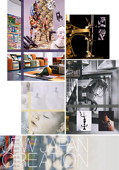
Devoted to the world of Japanese textiles, Tokyo-based Japan Creation (www.japancreation.com) is a core international textile exhibition displaying a beautiful array of fabrics, leathers, furs and trim components which exhibit the high level of creativity, quality and performance Japan textiles are known for. Reflecting Japan’s unique culture and aesthetic, the overarching viewpoint for Autumn/Winter 2011 addresses the principle of evolutionary thought and the need to focus on positivity in order to move forward. The four forecasted color trend palettes for Autumn/Winter 2011 highlight a bouquet of color ripe to invite a spirited radiance into our hearts.

Pantone Color Team

Tweet   Bookmark and Share

FOCAL POINTS: CREATING THAT PALPABLE PRESENCE IN THE HOME

Converging colors create a pathway invariably leading the eye to a given spot. When the hues are bold and uniquely combined, the effect is even more intense. Ideal for the dining room or family room, Focal Points is a palette of the warm, advancing shades of muskmelon, clay and burnt coral, ultimately introduced to the drama of aurora red, rosebloom, honeysuckle pink, dahlia purple and the winey cordovan, making for theatrical, intriguing color combinations.

VIEW HOME はこちら→

Tweet   Bookmark and Share


MARIJE VOGELZANG

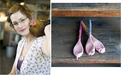
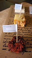
Marije Vogelzang is an Eating Designer with studios and experiential restaurants in Rotterdam and Amsterdam. TONES caught up with Marije between engagements for a discussion of her aesthetics and her work

TONES: You are an Eating Designer. How is that different from a Food Designer or Food Stylist?

MARIJE VOGELZANG: I believe that food is already perfectly designed by nature, and that there is a much more interesting field that lies beyond merely the shape of the food – though this is important too. What is interesting to me is the verb “to eat”. I think it’s most interesting to explore the creative potential of eating habits – culture, rituals, psychology, society and biology, for example.

TONES: Do you feel your work is akin to performance art?

MV: Sometimes it is. I did a Pasta Sauna at Performa09 in NY. The Pasta Sauna is a space you can enter and enjoy a bowl of freshly cooked pasta, while the boiling water steams your surroundings, creating a sauna.

TONES: How does the visual aspect of your work support the social themes you want to address?

MV: The visual aspect is a tool to communicate a story. If I want to tell you a story and I will shout it to you, you will not listen and put your hands over your ears. If I tell you a beautiful, engaging story, tasty and sparkling, you will be much more willing to listen. That’s how I see design. It’s a tool for communication, nothing more and nothing less.

TONES: What us the significance of color in your work?

MV: Color is highly important in any food and food culture, first of all because humans are very sensitive to the color of food for health reasons. Humans are trained to use color as a reference to the freshness of food. Blue food is many times toxic or poisonous or could reflect signs of decay. Also, from a cultural point of view, the color of food can be important. For example, egg-yolks are much paler in southern Europe than in Northern Europe. Northern Europeans prefer more orange colored yolks. For them it seems as if the egg is healthier. In reality the color doesn’t signify healthiness of an egg. It’s just a cultural preference. The color of the yolk gets determined by the food given to the chickens. Chicken food manufacturers have color-charts for farmers to choose their yolk-color from!

TONES: At what point do you incorporate color into your creative process?


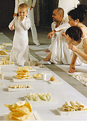
MV: It depends highly on the process. Sometimes color is the starting point— like with my White Funeral Dinner, made entirely from white food. White is the color of death in many countries. But sometimes color can be the tool. I did a food-color project in response to the issue of obesity in children in which I connected colors to positive associations and presented snacks in all the colors of the rainbow, to help children chose food in a different way. I was trying to replace the negative connotation of GOOD and BAD – black and white – into a positive connection between color and positive emotions. Sometimes I play with color because it can have a beautiful dramatic effect, like with the monochrome lunch I did for Wallpaper magazine. A table full of black, white, gray and brown food. No red, yellow, green and pink food. A beautiful picture of something we rarely see. I made this to celebrate the beauty of grayness, dullness and boredom, a forgotten gem in the hasty world of sparkles.


TONES: Does your use of color depend on the types of foods you are working with? Or, perhaps the clients you are creating for?

MV: Mostly it depends on the story I need to tell. If the story is about the miles your food has traveled to get to you, the choice of food and where it came from is important first; the taste is next important and then also the color. But if I do a project with the story about color – like the white funeral dinner – the color is more important; then I even made the chef cut all the yellow ends of the soy-sprouts to make them pure white.

TONES: What is the most unusual commission you have received?

MV: I was just thinking of doing a breastfeeding performance for a milk-exhibition in Paris. I am pregnant right now so this could be one of the few times that one could do something like this in life. But unfortunately they had a budget problem.

TONES: Can you describe a particularly memorable or controversial piece?

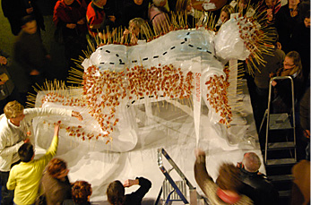
MV: One of the most memorable projects is an opening I did for the historical museum in Rotterdam. They had an exhibition about the Second World War. Rotterdam had been severely bombed during the war and the war ended in a hunger-winter during which many people died of starvation. Some of the people who were children then visited the opening. I decided to make small snacks from original war food from handwritten recipes I got from the resistance museum. When entering, the guests received coupons – like in the war; with the coupons they could get a cup of surrogate coffee and a ration of small bites on a cardboard plate. Some of the guests hadn’t had this kind of food in their mouth for more than 65 years. It caused them to re-live memories they didn’t know they had anymore. This was a very emotional but beautiful moment. For me, I realized that working with food is a very emotional and personal experience that no other material could evoke.

For Marije’s bio and links to her web presences, see our Contributors page.


Tweet   Bookmark and Share


お問い合わせ | 資料請求 | 友達に知らせる | メーリングリスト登録削除 | プライバシーポリシー

www.pantone.jpのWEBサイトはパントン社正規代理店 株式会社ユナイテッド・カラー・システムズがパントン社との契約により管理運営しております。
Pantone LLC is a wholly owned subsidiary of X-Rite, Incorporated. Portions © Pantone LLC, . All rights reserved.

  PANTONE The color of ideas.